The Best Use of Fonts in Your Resume
The font size and style of the resume you use to write your resume makes a big difference. Since employers have enough resumes to look at, they scan it in seconds. First impressions count. If there is something they do not like on a resume, such as an inappropriate or difficult-to-read font, they will be rejected.
Employers are more interested in what your resume says than the style your resume is written in. Therefore, readability and clarity should be two of the most important issues when deciding on the best resume font to use and what size to use.
These days, you don’t know how an employer will look at your resume. It is important to consider how a resume font looks on paper, on a monitor and on a phone or tablet. Many candidates use an online resume builder to produce compelling resumes that attract employers’ attention.
A complete guide to proceeding with typography. It explores the best fonts for resume, ideal font size, and other ways to visually improve your resume.
Which fonts are best for resumes?
The best fonts to use for resumes are clear and simple. Not only to make reading easier for potential employers, but also for ATS (Application Tracking Systems). ATS are systems that employers use to filter candidates. They narrow the selection until there is a more manageable number that can be read manually. Like people, they prefer readable resumes.
The worst resume fonts are those that try to be fun, wacky, weird or stupid. Not only do they give a completely false impression that they are unprofessional and sometimes childish, they also tend to be ambiguous. You might think that fonts like Comic Sans, Courier, and Gothic fonts can give your resume a touch of personality. Making.
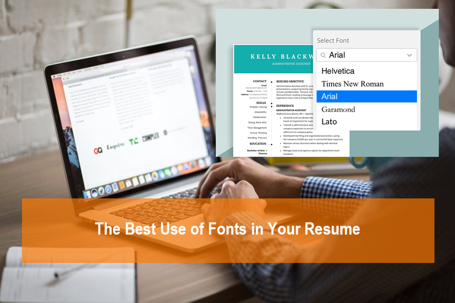
The two most common resume fonts are Arial and Times New Roman. Both are clear, readable, totally good choices, and better than the vast majority. An employer cannot judge you harshly for using them. However, they will make your resume like anyone else’s.
There are a number of alternative resume fonts that are as legible as Arial or Times New Roman but show you a little thought about choosing your resume font. Fonts such as Calibri, Avenir, Gill Sans, Verdana, and Cambria are all great options that will give your resume a fresher feel.

Which resume font size to use?
Don’t make the mistake of reducing the resume font size so you can squeeze in as many words as possible. Employers don’t want to work hard to read your resume and the last thing you want to do is squint them.
On the other hand, space in your resume is valuable as it should ideally be kept on a page. A large resume font size makes it look like you have nothing to say.
What is the best font for a resume 2020?,#What font should I use for my resume?,#Does Font matter on a resume?,#Is Cambria a good font for resumes?,#What is the most attractive font?,#Which font is most pleasing to the eye?,#Is size 11 font too small for resume?,#Can my resume be 2 pages?,#How far back should a resume go?,#How can I make my resume stand out?,#How big should your name be on a resume?,#What is the easiest font to read?,#What is a good rule for font size?,#What is the smallest font?,#What is a modern font?,#How do I change text size?,#What is the smallest readable font size?,#What font do cell phones use?,#What are the common mistakes of a resume?,#Should I put my full name on my resume?,#Should your name be in all caps on a resume?,#Can you leave jobs off your resume?,#How should resume look in 2020?,#Is it OK not to include dates on your resume?,#What is the best font and size for a resume?
The best resume font size is 11 (definitely not larger than 12) for the main body of the text. The homepage title (where your name is) should be much bigger, around 22-24. Each section should have 14 subtitles roughly.
Resume format: It’s always a good idea to submit your resume in PDF format. In other formats such as a Word document, the recipient’s computer or device automatically changes the font. This can completely change the look of the document. Since fonts differ in the amount of space the characters take up, they can look messy.
Other resume typography and design tips
Try to avoid lengthy bits of text, as they are annoying to employers. They don’t want to go through paragraphs full of words. Use visual aids such as headings, bullets, columns, and bold to break up text into more digestible pieces. Read this guide on how to write a good resume for more tips.
No matter what font and font size you use for your resume and how you format it, make sure the style is consistent throughout. If the font size, line spacing, margin size, or anything else is not uniform, it looks sloppy and recommends not paying attention to details.
What are the best colors for your resume? You can use a color from your resume to strategically highlight important parts of your resume and make it look more attractive. Use a simple color scheme and avoid using inappropriate colors.
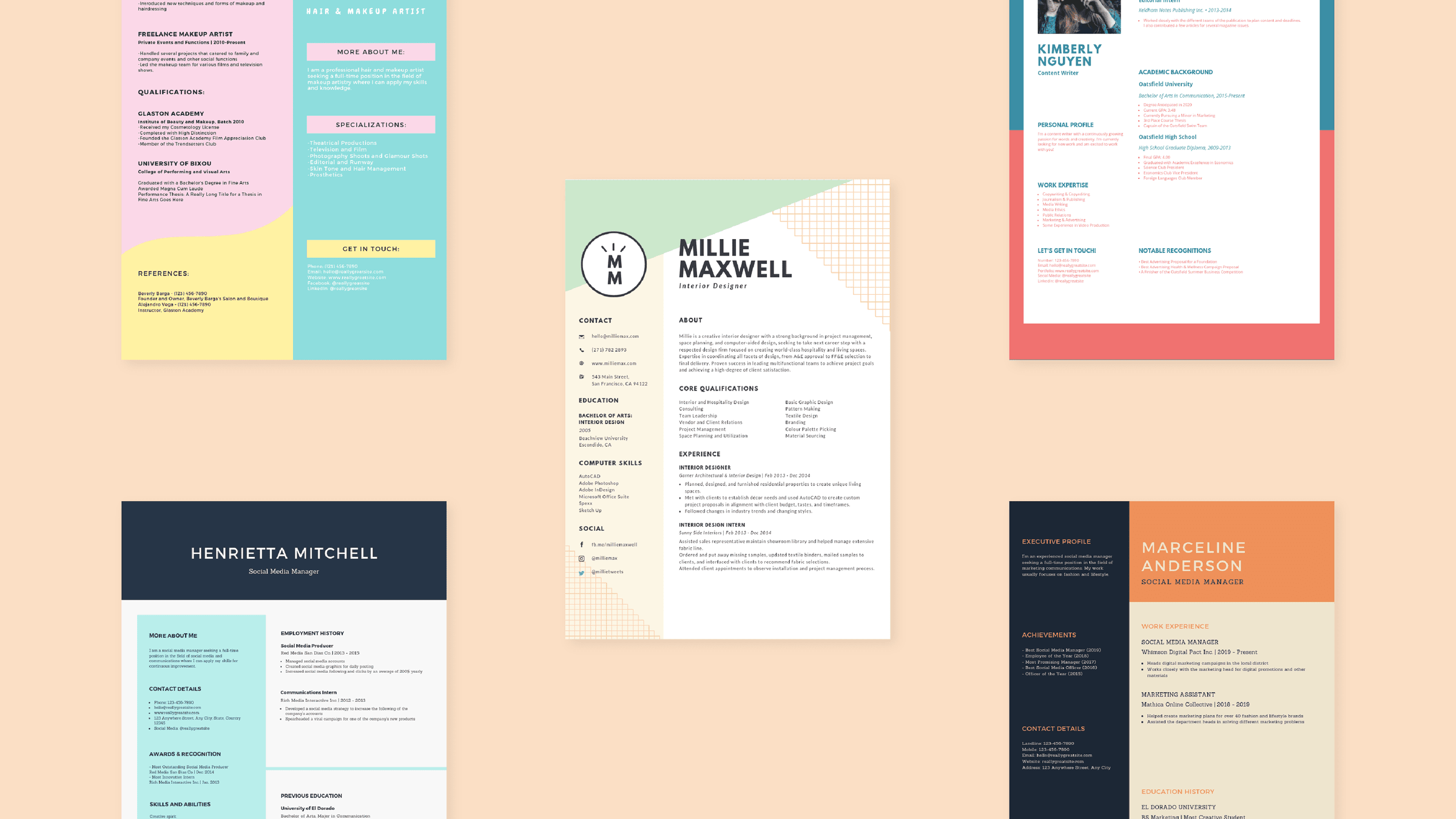
Using resume templates is the most effective way to make your resume appealing to the eye. They are professionally designed and have industry-specific templates that are quick and easy to edit.
Designing a resume that stands out can be difficult and time consuming for those without design skills. Professional resume templates allow you to work on your resume less and spend more time applying for jobs.


Comments